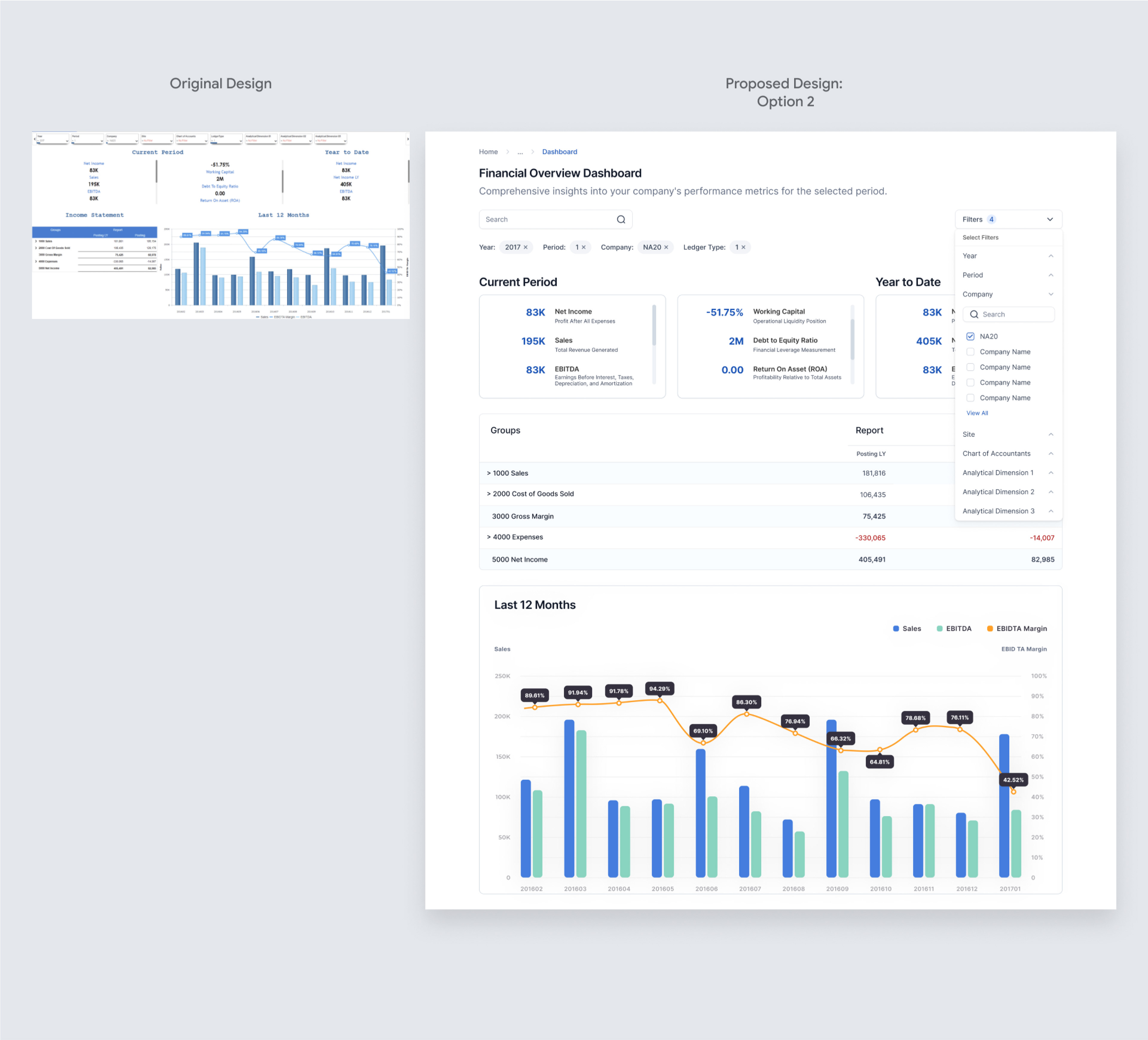
In response to our collaborative discussions, I took the initiative to review and revamp the Financial Overview Dashboard. The primary goal was to ensure a more intuitive and user-friendly experience, enhancing readability and optimizing navigation.
Design Changes:
- Font Change: Transitioned to the "Inter" font to improve readability and provide a sleek appearance.
- Navigation and Headers: Introduced a structured header section inclusive of breadcrumbs for smoother navigation. Enhanced clarity with headers and subheaders for "Current Period" and "Year to Date" sections.
- Visual Indicators: Negative figures are now highlighted in red for instant recognition of potential areas of concern. Positive numbers can be highlighted in green, enabling quick discernment of performance trends and outliers.
Compact View:
Maintained the original layout's compactness, with the chart and table side-by-side. Offers a concise overview, preserving familiarity for existing users.
Maintained a design closer to the original, with all filter items visible atop the dashboard.
Top Filters Refinement: Filter Dropdown
Introduced a filter dropdown to neatly house all filtering options. Selected filters are prominently displayed as chips/badges, reducing visual clutter.